Noona's
Introduction
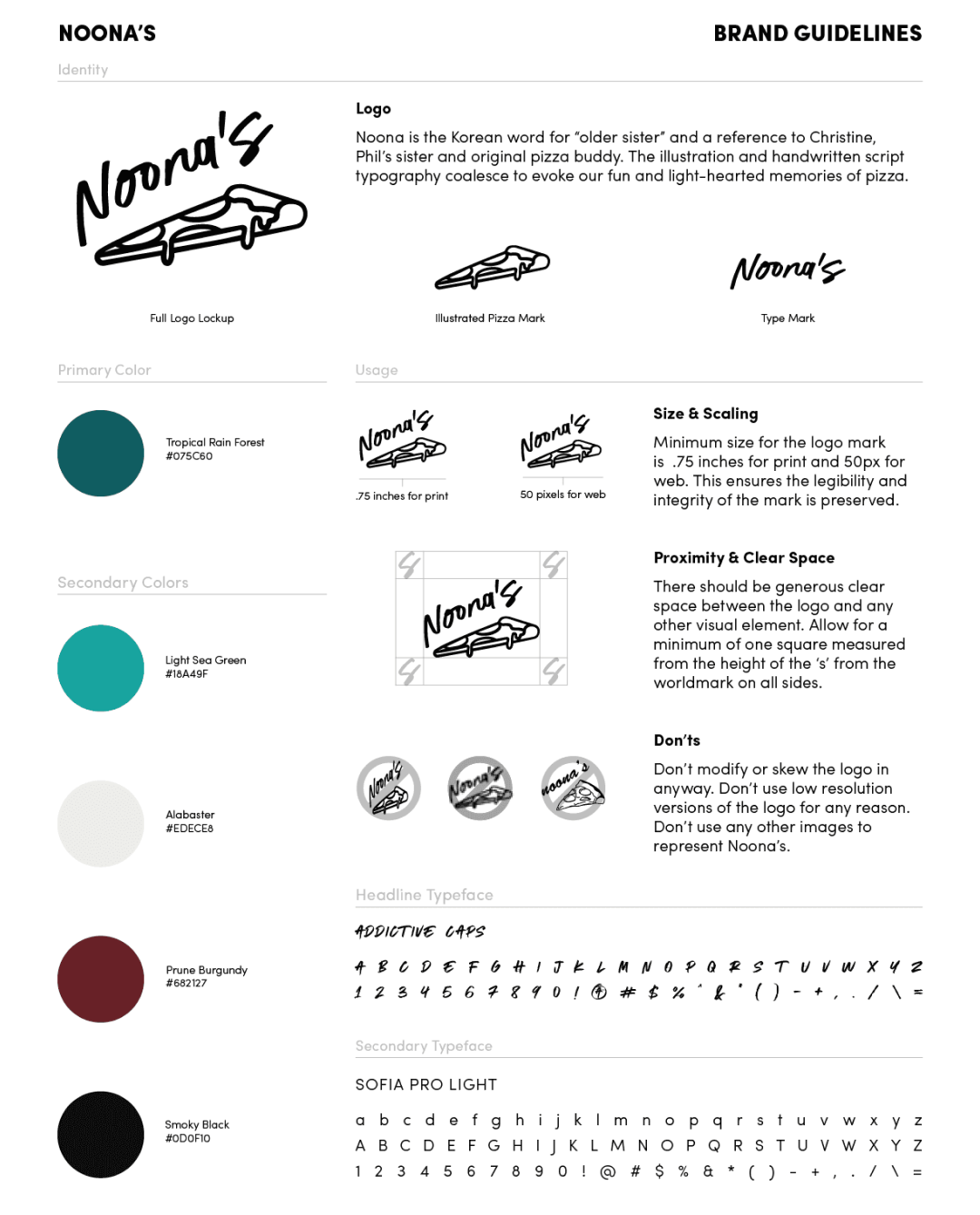
Noona's was a pizza restaurant who's namesake was a variation in spelling on the Korean word for older sister. The owner wanted something that felt like a fusion that reflected the food, while staying true to the community aspect of a pizza joint.
Process
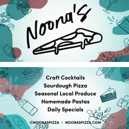
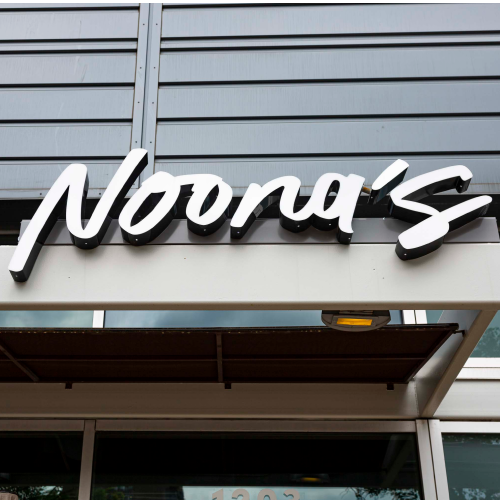
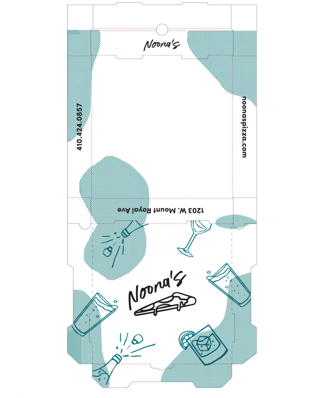
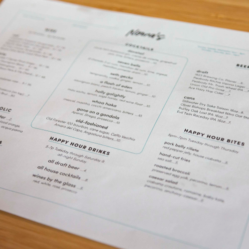
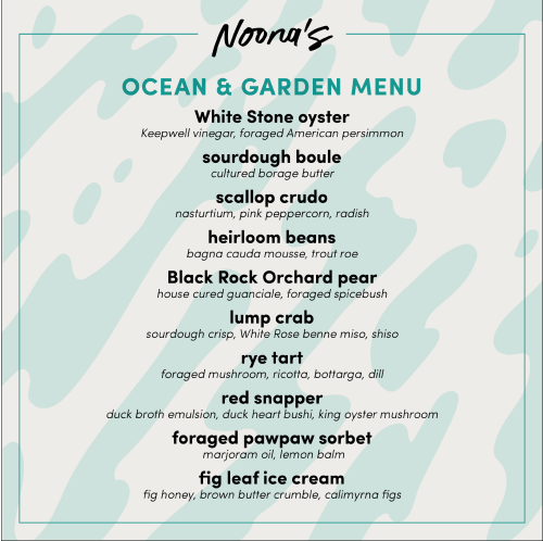
I worked on various designs for the logo and menu. We settled on a slice with an irregular script type that was tilted above the slice. The color scheme was meant to go with the interior design elements that had a lot of pattern, blue and wine colors. The branding could flex for pizza boxes, signage, menus, event flyers, banners and much much more. This was an excellent opportuninty to create and evolve the brand as the restaurants needs and menu changed.