haenyo
Introduction
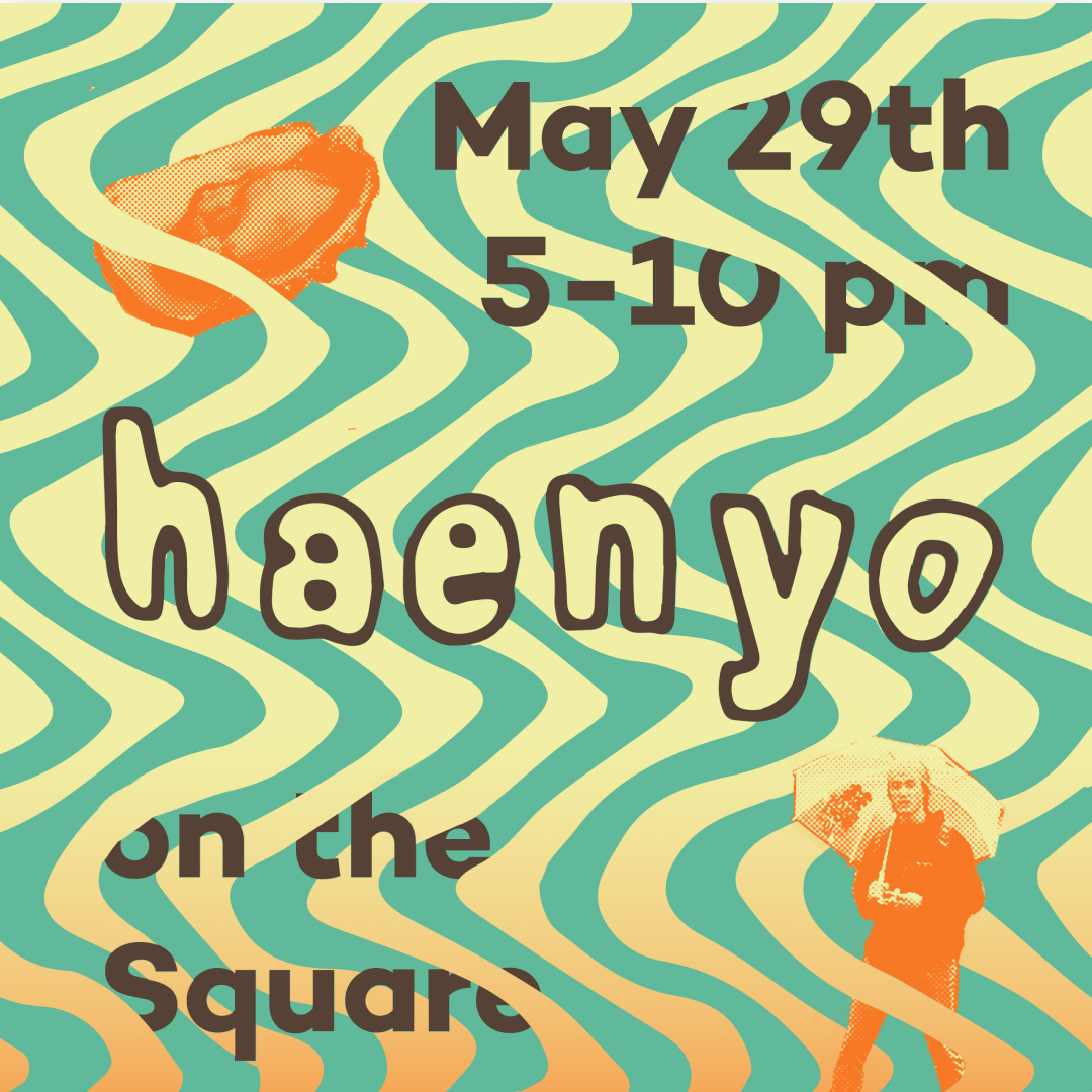
In 2017 after working closely with talented chefs at a restaurant group, I met two chefs with the ambition to start a Korean fusion pop-up. They asked me to do the branding, based off the spirit of the women who dive for sea creatures in Korea. They wanted something as bright and expressive as the food they were serving.
Process
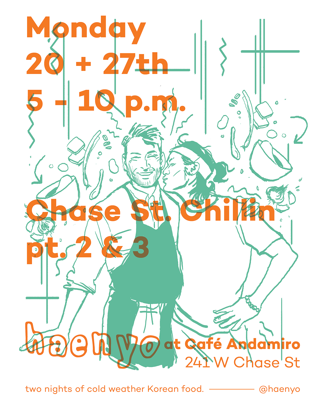
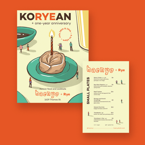
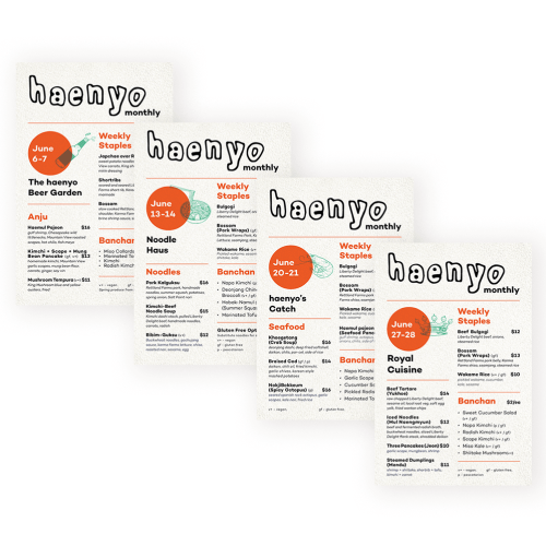
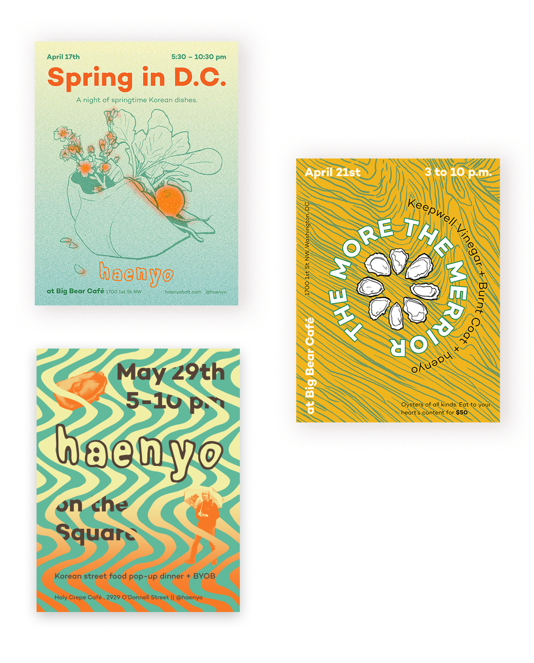
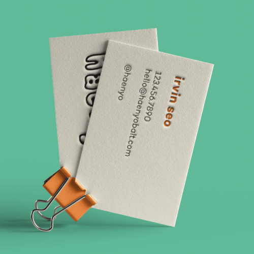
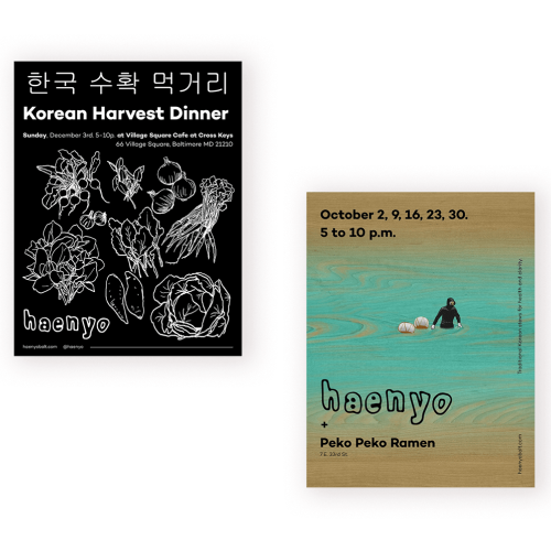
In the three years of pop-up dinners various guest illustrators and designers collaborated on posters, menus, and social promotions. Some events were so well attended food ran out within 90 mins of service. The typography is meant to showcase the moving waves and focus on seafood. The color scheme came from the sun in contrast with the ocean. The posters each had accompanying menus with different themes based off of the restaurants the pop-ups took over. To this day this project was the most fulfilling and challenging in my career.